Showing posts with label comics. Show all posts

Friday, August 9, 2019

Ernie Colón (1931-2019)


The official Facebook page for comics artist Ernie Colón just announced that Ernie passed away yesterday after a struggle with cancer. Ernie's work on Arak, Son of Thunder (he co-created the character with Roy Thomas and pencilled the first twelve issues) was part and parcel of my early years in the tabletop RPG scene: Arak #1 was released in May 1981, ten months after I acquired the Eric Holmes Dungeons & Dragons boxed set. I don't think any Quontauka warriors showed up in my D&D games, but I do know that Colón's vision of a mythical Carolingian Europe was central to the way that I saw D&D in my mind's eye. His cover for Arak #8 (December 1981) is one of my favorite pieces of his as are his covers for #9 (January 1982) and #10 (February 1982). That was a great three-month run! Thanks for all the great comics work, Ernie! RIP.


Saturday, November 5, 2016

A Brief Meditation on Marvel's Doctor Strange


Saw Benedict Cumberbatch as Doctor Strange last night in IMAX 3D. Totally worth the expense: this is the very rare film that makes effective use of 3D. In fact, I'd probably rate the film as one of my top three superhero picks, primarily because director Scott Derrickson actually connects the form of his film to its thematic content, playing games with sequentiality and time that gesture toward the ways that the comics page does the same. He doesn't make the valiant but doomed attempt to replicate the simultaneous spatiality of the comics page that we saw in Ang Lee's Hulk—instead Derrickson makes the linearity of cinema's temporal experience a means of exploring the plot's interest in immortality and causality.

Put another way, in Doctor Strange, this iconography:


Equals this iconography:


The bar has been raised for the filmic realization of comics, folks!

Friday, September 26, 2014

[13th Age] One Unique Thing, Rat Queens Style


I can't be the only person in the world who thought "One Unique Thing" when reading this panel of Hannah and Orc Dave in Kurtis Wiebe and Rob Upchurch's Rat Queens #5, can I?

Wednesday, July 30, 2014

The Book of Kirby


Over on Twitter, Copra creator Michel Fiffe announced a blog post describing his process producing Cobra #16 as one inspired by the King of Comics: "Kirby Is My Co-Pilot." His choice of phrase reminded me of the old saying "God is my co-pilot," and the above saying immediately popped into my head. Use this meme well, and use it wisely. But most of all, use it to celebrate Jack Kirby!

P. S. If you haven't read Fiffe's Copra (his love letter to Ostrander and Yale's Suicide Squad), now is a great time to start: Bergen Street Comics is about to release a TPB collecting the first six issues of the self-produced series. Pre-order the book; you won't be sorry you did!

Saturday, July 12, 2014

Diamonds Are Forever in Frank Miller's Daredevil


[Here's the last of my old comics blog essays on page layout, a piece on Frank Miller and Klaus Janson from 2 May 2012. Let me know if you'd like to see more layout analyses in this vein. Thanks!]

I've been rereading Frank Miller's run on Daredevil lately, and the following page from "Gang War!" (issue #172, July 1981) caught my eye:


Here Miller and inker Klaus Janson turn in a wonderful piece of fight choreography. The use of tiered panels gives them lots of room for their figural work (the entire issue has lots going on panel-wise; this fight is mostly done in horizontal tiers, setting up a spectacular shift on the page after this one, a page that replaces horizontals with verticals). And their figures are spectacular! The Z-patterns I've discussed previously on this blog show up here as well, but doubled (or possibly even tripled). The first Z occupies panels 1-2: Daredevil's left hook draws our eye through the first panel to the right (even as his right arm reverses this motion, tossing Bulleye's gun away to the left), while the elbow to Bullseye's back takes us down and left into the second panel (aided by motion lines and the deliberate crossing of the gutter by Daredevil's hands). The leftward force of Daredevil's attack focuses our attention on Bulleye's kick in the left half of the panel; that exchange of blows is also a second diagonal line down from panel 1, a line formed by the angles Daredevil occupies in both panels. A similar parallelism is taking place on the right side of the panels as Bullseye's elbow draws our attention down to his head shooting forward. That head jerk sends us to panel 3 (as does the heavy use of black shadow on the Daredevil figures in both panels' left halves).

Panel 3 continues the downward, leftward stroke of the Z-pattern. Once again, gutter crossings aid and abet our eyes here: Bullseye's knee gets us from panel 2 to panel 3, and the brick in his left hand in panel 4 connects back to panel 3 (assisted by the lines on his glove and boot). But the shift from panel 4 to panel 5 splits. The main stroke of the Z runs down and left into the rightward moving boot that Bullseye delivers to Daredevil's face–a kick that sets up the final, horizontal strike of the Z. At the same time, Bullseye's panel 4 brick attack sets up another diagonal path into panel 5, this time running down and right into another kick by the villain. Motion lines aid this transition, although they establish a bit of tension between the lines of the page layout and the diegetic action of the story—Bullseye's brick attack and second kick are both moving up and left even as our eye moves down and right.

Panel 6 looks like it's starting a new Z-pattern with panel 5 as the top horizontal stroke, and panel 6 as the beginning of the downward diagonal stroke. The motion of the figures in the panel might be a truncated bottom horizontal, but something else is going on here besides Z-patterns. Look at panels 2 and 5: both break the page's general rule of one action per panel. Panel 2 gives us two attacks, and so does panel 5. Moreover, both attacks aim at the center of the panel: the lefthand attack in each panel moves right while the righthand attack moves left.

There's also a mirror-effect going on here. Panels 1-3 depict Daredevil in charge of the encounter, while panels 4-6 give Bullseye an edge. Panel 2's double-figures are mirrored in an X-pattern with panel 5's double-figures: we see all of the combatants in the exchange on the left half of panel 2 and on the right half of panel 5, while the right half of panel 2 and the left half of panel 5 give us close-up shots of the action (even if the character getting struck differs in the two panels). The bricks on the right side of panel 3 are mirrored by the bricks on the right side of panel 6. Daredevil is on the left in both panels 1 and 4, Bulleye's on the right. Finally, in panels 3 and 6, Bullseye is positioned on top of Daredevil.

In fact, the more I look at the page, the more I see two vertically-stacked diamond patterns. The first diamond is panels 1-3; the second, panels 4-6. The Z-patterns help us move from panel to panel, but the diamond patterns anchor the entire page as a single instance of layout. Perfectly legible stuff, but awesomely intricate as well.

Thursday, July 10, 2014

The Line-Up for My Fall 2014 Comics Course


Here, in pictorial form, are the ten titles I'll be teaching this coming fall semester in ENGL 121, the comics and graphic narratives class I added to my university's literature curriculum. The books are spread out across the 76 years since Superman's first appearance in 1938. (That said, the 40% of the titles that were published in or after 2000 reflect the mainstream presses' discovery that comics could be critically and commercially successful.) Los Bros didn't make it on the syllabus this go-round, but I'm reading Love & Rockets and will probably be adding them when I teach the class for the third time.

Wednesday, July 9, 2014

[5E] Defending In-Character Inspiration via Walt Simonson's Thor


Here's a more constructive variation on my previous post. There are been complaints that the new Inspiration mechanic in D&D 5E is "dissociated," "meta-gaming" that pulls a player out-of-character. How Inspiration does this while the ability to fight without impairment even at 1 HP out of 60 doesn't is a question that never seems to get answered. (The answer, by the way, is that different players occupy different locations on the immersion spectrum and thus lose immersion at different times in response to different mechanics.)

I find that Inspiration perfectly maps onto in-character decision making, and I'm going to use Walt Simonson's Thor #362 to illustrate what I mean.


The situation is this: Thor has led the forces of Asgard into Hel to rescue the souls of mortals falsely imprisoned there. He's managed to succeed, but at the cost of grievous injuries to his face from Hela's clutches. As the Asgardians withdraw with the rescued souls, Hela uses a technicality to violate the cease-fire between the two sides and sends her undead armies after them. For the Asgardians to escape, someone has to stay behind and hold the Gjallerbru against the dead long enough for the good guys to make it past the boundaries of death. Like the hero he is, Thor states he'll do this. The others protest in vain, and Thor is only stopped from sacrificing himself when Skurge the Executioner, a former enemy of Thor's in the employ of the seductive Enchantress, coldcocks our hero and offers to take his place at the bridge:


In game terms, Skurge is the neutral evil low-Wisdom fighter who's been a pain in Thor's ass for several hundred sessions / issues. Out of nowhere he makes this amazing in-character speech explaining his willingness to die for his former foes' sake. The player of Balder, the lawful good paladin who was resurrected just before the start of Simonson's run, is so impressed by Skurge's player's speech that he grants his Inspiration point to Skurge (as per p. 36 of the Basic Rules PDF). The actual exchange of the point is right there on the page in panel 6, the moment when Balder hands Skurge his M-16. (The Asgardians are rocking American longarms in this storyline—it's a comics thing.)

This is a perfect example of how a simpatico group of players can make in-character sense of the player-instigated Inspiration trading mechanic. Skurge's speech is precisely the sort of "good roleplaying" the rules mention, and his statement that Balder is the only god to never laugh at him works an in-character explanation of why the point moves from the paladin to the fighter. DM Walt Simonson probably could have just as easily given Skurge's player the point in response to his awesome roleplaying, but Balder's player beat him to the punch.

OK, what about Skurge's expenditure of the point? How is that conceivably in-character? Well, in the first place, I think some people are getting hung up on the term "Inspiration." You could just as easily call the mechanic "Willpower" or "Determination." It's the moment when someone buckles down to get the job done, when their concentration narrows and their range of possibilities expands. Don't assume that it's only a meta-fictional trick of authors in complete control of their characters and plots: I know for a lived fact that my Bond to my family has allowed me to momentarily alter a situation to my favor. I was briefly "inspired" by that trait, and the odds shifted. As a result of such experiences, the expenditure of an Inspiration point seems perfectly in-character to me—especially since the D&D 5E has taken care to ensure that Inspiration is a binary state (you only ever have one point at the most; you can't stockpile it or store it in some sort of "Inspiration bank").

In Skurge's case, it's his Flaw (his unrequited love for the Enchantress) that motivates his expenditure of the Inspiration point at Gjallerbru:


(Wait for it ... we're getting there ... just wanted to show this awesome page layout: note how the tier 2 panels containing the approaching undead cavalry widen as the bad guys approach Skurge and the reader, and revel in that amazing final tier with the stylized Norse bridge backdrop.)


"As the warriors of death ride hard down upon him ... the Executioner turns his thoughts from the flowing blond hair that always dances before his eyes ... and begins to do the thing he does best! BUDDA BUDDA BUDDA BUDDA KAPOW! KAPOW! BLAM! BLAM! BEYOWWW!" Tier 2, panel 2 is the moment where he spends the Inspiration he got from Balder to whoop undead soldier ass. To me, that expenditure is as in-character as it gets.

Obviously, others may feel differently, may find that even this relatively restrained mechanic (players periodically get a point they may spend to justify gaining advantage) breaks their sense of immersion. I am in no way suggesting that my experiences and tolerances are universal. But I do think this post demonstrates that so-called "dissociation" is not an objective quality of mechanics but a subjective quality of players—and why I'd like to see the term retired in favor of honest discussions of personal gaming preferences and tolerances.

The next two pages of Thor #362 boil down to Simonson dropping the mike and walking off stage:


(Pardon me while I sit here a spell and contemplate the parallel yet contradictory motions of tiers 2 and 3: tier 2 pulls back away from Skurge, tier 3 zooms in on the M-16's muzzle.)


In the immortal words of the Kool-Aid Man: "OH YEAH!"

What, you thought I was going to let you go without showing all of the greatest death scene in the history of superhero comics?*

* OK, Supergirl's death in Crisis on Infinite Earths #7 is up there too. Props to Marv Wolfman and George Perez for that!

Friday, July 4, 2014

Happy Independence Day!


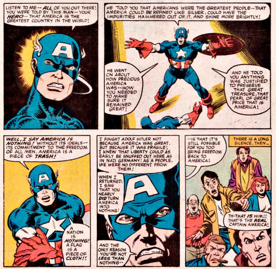
Peter Gillis and Sal Buscema deliver one of my favorite Captain America speeches ever in What If #44 (April 1984). Be safe this weekend!


Thursday, July 3, 2014

Looking-Glass Layout with Steve Ditko


[Here's the penultimate comics layout analysis from my old comics blog. In this entry from 9 August 2010, I'm looking at the work of Steve Ditko . . . ]

I've moved on to reading all of the Lee-Ditko run on Amazing Spider-Man, and I want to take a break from the Kirby analysis by looking at Dikto's layout for page 16 of ASM #23:


I'm struggling for a vocabulary that would allow me to express what I'm seeing on this page that distinguishes Ditko from Kirby.  Perhaps the best way to express the distinction is that Ditko concentrates on motion within panels instead of motion between panels as we see in Kirby.  Ditko's characters don't flow as easily from panel to panel as Kirby's do; Ditko will often (in other issues of AMS) make radical shifts in viewpoint as he makes the transition between panels.  I can't recall Kirby making use of extradiegetic arrows to guide the reader's attention as happens in panels 6-8 of this page.  So a point for Kirby?  Maybe . . . but I still really love the layout of this page and find Dikto a dynamic artist.

What impresses me most about the page is Ditko's use of mirrored panels--not in the panels' contents, but in their shape and placement on the page.  The top half of the page (panels 1-4) is repeated in the bottom half of the page (panels 5-8), but in a way that creates an "X"-pattern.  The big panels 1 and 8 form one stroke of the X, while the little panel sequences 2-4 and 5-7 form the other stroke.  Put another way, Ditko takes the second set of panels and flips them left to right to generate the "X"-shape.

The contents of the panels support this structure: panels 1 and 8 are the only two to feature both Spidey and the Green Goblin.  In both panels, Spidey is positioned toward the outer edge of the panel while the Goblin occupies the inner edge (additional instances of mirroring across the y-axis of the page).  Spidey is upside down and swinging up and to the right in panel 1; in panel 8, he's still upside down, but now swinging down and to the left.  (He's also coming toward us in panel 8 while moving away from us back in panel 1.)  The Goblin leans left in panel 1 and right in panel 8, yet more mirroring.

Panels 2-3 and 5-6 are also mirrored panels, but this time they flip left across the y-axis of the page instead of right (as in the case of panels 1 and 8).  Panel 2 shows the Goblin's hand releasing a pumpkin bomb; panel 3, Spidey's hand shooting a web to block the bomb.  The diagonal line repeated in both panels (hand/bomb in panel 2, hand/web/bomb in panel 3) is then repeated yet again in panels 5-6.  However, this time, the characters have traded places: now it's Spidey who acts first in panel 5, and the Goblin who wards off the attack second in panel 6.

Panels 4 and 7 offer similar layouts yet utterly different contents.  In panel 4, it's Spidey who acts, tossing the pumpkin bomb behind him to his left (and our right).  In panel 7, it's the Goblin's turn: he pulls Spidey's web in the opposite direction (behind him to his right and to our left).  The curves formed by the motion lines of Spidey's arm in panel 4 and the web shape in panel 7 are mirror-images of one another.

So while Ditko does feel the need to clarify the diegetic sequence of the page's action with the arrows connecting panels 6-8, he nonetheless does a brilliant job of integrating the entire page through an innovative page layout.

Saturday, June 28, 2014

Kirby's Legacy Lives On


[Starting to run out of comics-commentary "reprints" from my defunct Kracalactaka blog. Here's one from 6 August 2010 on a tribute to Jack Kirby in the pages of Alan Moore and Rick Veitch's Supreme.] 

I was reading Alan Moore's wonderful revamp of Rob Liefield's Supreme last night and came across a page by artist Rick Veitch that demonstrates Kirby's influence.  Of course, it's not particularly a surprise that this page is Kirbeyesque: the issue from which it's taken (issue #6 of Supreme: The Return) is an explicit homage to Kirby's lifework.  Nevertheless, Veitch's work here is more than a pastiche of Kirby's style, but a testament to his mastery of Kirby's layout techniques.  The page above is from a sequence in the comic where Supreme encounters a cigar-chomping "imagineer" who prefer to go by the sobriquet "King."

There's so much to love about this page.  Matt Yackey and Digital Broome (the colorists) use the traditional "color spectrum" to generate an "X" layout for the page: panels 1 and 4 form one stroke of "X," giving us natural colors brown and green bounded by "cool" colors violet and blue, while panels 2 and 3 use the "warm" colors yellow and red to form the other stroke.  Veitch strengthens this second stroke with the motion lines in panel 2, diagonals replicated by the Kirby krackle cigar in panel 3.

Veitch also uses the "Z" layout we saw in the Kirby page I analyzed in my last blog entry.  Supreme (drawn by Veitch in the 1990s Image style customary to the character) navigates his way across the four panel layout.  In panel 1, he flies away from us and to our right, drawing the eyes to panel 2--where he turns toward us and flies down and left to panel 3.  In panel 3, Supreme turns again, still facing us, but this time flying down and right into panel 4.  There he ends the page pointing up and to the right, with his back turned to us: a pose basically identical to the one he assumed in panel 1.

At the same time, Veitch makes Supreme progressively larger in each panel, an increase in size that heightens the Kirbyesque sense of motion on the page--a nice contrast to the more static quadrants of the "King"'s face.  Even there, though, there is motion as each quadrant shifts in color and texture from one of the four classical elements to another (earth to air to fire to water).

Thursday, June 26, 2014

Kirby Page Layout ... Now with Panther Power


[Time for another Thursday "reprint" from Kracalataka, this time from 4 August 2011]

There's a Kirby page from Fantastic Four #52--the Black Panther's debut issue--that I've been wanting to talk about ever since I read Hagop's lovely discussion of it at The Short Box back in February.  Here's the page in question:


Hagop does a good job of discussing what makes individual panels on this page exemplars of Kirby's style.  What I'd like to add to that analysis is a reading of the page's overall layout, one that takes into account Kirby's ability to masterfully direct the reader's eye from one panel to the next.

For example, we once again see our old friend the Z-pattern.  Here it's based on Ben Grimm (with an assist from Johnny Storm).  In panel 1, Ben rushes toward the right edge of the panel (and the page), attempting to seize the FF's Wakandan guide before he escapes.  The motion lines contribute to the rightward dynamic of the panel.  In panel 2, Ben's figure still anchors the Z-pattern, but now Ben has been flipped right-to-left, and his left arm points down and left, directing our eyes to the second tier of panels.  Panel 3 (the first panel of the second tier) continues the downward diagonal begun in panel 2.  Finally, the Z-pattern is completed on the third tier of panels in panel 5: the falling figure of the Thing completes the downward diagonal's leftward motion, and the Torch's sprawling form pulls us to the right edge of the page, finishing the base of the Z.  (This is why it's important that the Torch show up in panel 3, supporting Ben from the right side of that panel--the same basic layout of figures that we see in panel 5.)

Kirby complicates matters with the appearance of T'Challa in panel 4.  Visuals match the narrative here as T'Challa intrudes upon the Fantastic Four, and the figure of the Black Panther breaks into the Z-pattern of the page.  Where the Panther is concerned, panels 4 and 5 form a second downward diagonal parallel to the first.  T'Challa leaps down upon the unsuspecting heroes in panel 4, a jump completed in panel 5 as he knocks them sprawling.  (The legs akimbo of panel 4 become the complete spread of panel 5--a single fluid motion captured in two moments.)

The Panther's attack also disrupts the page's panel grid.  Up until panel 5, we've been led to expect a six-panel grid broken down into two panels per tier, three tiers page (exactly what we'll get on the next page of the issue, page 11, and throughout much of the issue as a whole).  Kirby departs from that expectation here, giving us  instead a single elongated panel that covers the full extent of the tier.  Story drives layout: T'Challa kicks Ben and Johnny, and their flying bodies literally push the panel down and out toward the edges of the page--to the point where Johnny's body pressures the boundaries of human physiology to mimic the right angle of the panel's lower righthand corner. Again, motion lines are used expertly here, extending the panel out from the center point of T'Challa--whose impossibly split legs also copy the panel boundary (in this case, the long horizontal line at the top).  The Black Panther pushes the bottom line of the Z to its limits, causing it to bow out in the middle.

It's the clarity of layout that impresses me the most here.  While I love much of the art in modern comics, I find that the layout skills pioneered by Kirby and others are less in evidence, an absence of craft that undermines the reading experience.  But there are some nice modern counter-examples, and I'll discuss a few of those when I next find a chance to look at page layout.

Thursday, June 19, 2014

More Kirby Layout Goodness


[Another "reprint" from my defunct Kracalactaka! blog. Edited to remove a reference to a 2010 familial health crisis that ended for the better.]

This time let's look at a page from Fantastic Four #58 . . .


What we've got here is a beautiful Z-pattern that naturally syncs your eyes and the flow of narrative action on the page. The eye goes from Ben to Ben in each panel (expect for the transition between panels 5 and 6 which is handled via Doom's figure as well as the natural causal link between the makeshift spear in Ben's hand and the explosion that spear causes when it hits Doom). There is also the same sort of X-pattern that I discussed in my previous post on Kirby's Thor layouts. You have a line descending from the "ZAFFT!" in panel 1 through the "RAKK!" in panel 3 to the "ZOT!" in panel 5. Crossing that line is the one descending from the Ben Grimm in panel 2 through the Ben in panel 3 to the Ben in panel 4. The diagonal line formed by the wreckage that Ben demolishes in panel 3 adds to this larger portion of the X-pattern.

There's also a lovely bit of variation in panel size and shape here as well. The top and bottom tiers of panels consist of two equally-sized squares each. These tiers serve to frame the middle panel, a single rectangle that expands left (with the eye's own motion as it shifts down and left from panel 2) to mirror Ben's violent action in panel. A nice bit of emphasis by the King here!

Thursday, June 12, 2014

Why Kirby Is King


[This post was originally published on my now-defunct Kracalataka! blog back on 7 July 2010. I'm going to be slowly moving the more interesting posts from that blog here to Vargold over the next few weeks.]

I've been reading the Stan Lee/Jack Kirby run on The Mighty Thor, and I came across these pages from Thor 137 ("The Thunder God and the Troll") that demonstrate Kirby's command of page layout.  Here's page 2, my first example:


Here Kirby depicts a competition between Thor and the goddess Sif, his new love interest.  (I get the sense that, by issue 137, even Lee was getting tired of mortal love interest Jane Foster.)  What I love about the layout on this page is the interaction of the six panels.  The first panel (Sif launching a javelin toward the reader's right) is mirrored by the sixth and last panel (Thor throwing Mjolnir toward the reader's left).  The second panel (Sif's javelin lodging in the pole) is mirrored by the fifth and penultimate panel (where the force of Mjolnir's impact on the ground causes the spears to burst out of the pole).  The overall effect is that of an "X" pattern: panels 1 and 6 form the first line of the X while panels 2 and 5 form the second line.  The coloring ties the layout together even more.  (There's no colorist credited for the issue, so I'm not sure who to praise here.)  Panels 2 and 6 match up due to their yellow backgrounds—but they're also linked diagonally to panel 3 by virtue of the rather large swatch of yellow represented by Thor's golden locks.  Blue dominates the reverse pattern of panels 1, 4, and 5.

My second example is page 5:


Yellow backdrops and action lines tie together panels 1 and 4.  So does content: in both panels, Thor is smashing an enemy's weapon.  The result is a diagonal pairing that continues the force of Thor's panel 1 blow down into panel 4: in both cases, Mjolnir moves down and to the reader's right.  Panels 2 and 3 are tied together by the diagonal line linking the troll missile before and after it is launched at Thor.  In panel 2, the missile points down and left to the center of the layout; in panel 3, it zooms up and right.  The layout is once again an "X" shape.  At the same time, though, Kirby ties together panels 3 and 4 in a lovely action sequence: in panel 3, Thor prepares to strike by moving Mjolnir down and to his left.  Then, in panel 4, Thor ends the page with a "Thbooom!" by swinging his hammer across his body to his right.  The layout result is a beautiful arc of motion across the gutter between the panels.

Monday, April 22, 2013

Tom Scioli's American Barbarian


Since I've added comics to Vargold's blogging remit, I thought it might be nice to write a post about G0dland artist Tom Scioli's gonzo web-comic American Barbarian. Set in a post-apocalyptic American akin to that of Jack Kirby's Kamandi and the cartoon Thundarr the Barbarian, American Barbarian pits its Kirbyeseque hero, the red-white-and-blue-haired warrior Rick Yoosamon, against the villainous giant Two-Tank Omen. (He's a pharaoh with tanks for feet.) You can read the entire book on Scioli's website (linked above) or buy a hardcover copy from AdHouseBooks.

In this post, I want to focus on a gag of Scioli's that not only demonstrates the series' sense of humor but also shows the sort of artistic effect that comics can pull off effortlessly. Early on in the series, the forces of Two-Tank Omen attack and kill Rick's father and brothers. When Rick discovers his family's bodies, he fights through his grief to a sense of outrage and a desire for vengeance, a desire he makes permanent by marking it on his flesh:


The immediate reveal of what Rick carves on his fingertips is an unfortunate Photoshop job on what appears to be Scioli's own hands. Much better is the drawn reveal as Rick attempts to get close to Two-Tank Omen by pretending to want to join the villains' forces. The word balloons on the page contain the lies Rick tells Two-Tank Omen; the character POV in the last panel reveals the truth of what Rick feels in his heart:


Triple exclamation-points aside, this panel is not the gag's pay-off, however. That comes latter as Rick directly takes the fight to Two-Tank Omen in pitched battle. He makes short work of the villain's minions, but misses his chance to kill his family's murderer. Rick finds himself once again staring at his fingers—not with determination but with recrimination:


In the top tier of the page, Scioli replicates the POV of the earlier panel where Rick swears his "allegiance" to Two-Tank Omen. But he pulls back to a more distant position, isolating Rick and emphasizing the diminishment that comes with failure. We're not sharing Rick's POV here, but critically look at him. The bottom tier reverses the "camera" angle and zooms in, giving us a shot of Rick's expression as he considers his fingers. The grim punchline follows on the very next page. The implicit question is "Revenge!!!?" The answer is:


That top panel is one of my favorite in all comics. Scioli uses the mirror-image effect in Rick's pupil to turn heroic will into impotent failure, "revenge" into "never." He underlines the point by zooming in even further and adding red blood vessels to connect to the red scars on Rick's fingertips. It's a brilliant gag, and I can't see it being pulled off anywhere but comics. You could possibly do it in film, but it would appear contrived whereas here it appears wholly natural. American Barbarian is thus on one hand Kirby-pastiche but on another Tom Scioli's own artistic statement. I highly recommend it.

(BTW, if these pages don't convince you to read the book, how about this one?


"Robosaurs? I'm fucked!" is essentially more or less the cri-de-coeur of every Old School player character ever.)

Thursday, April 18, 2013

Great Caesar's Ghost, Superman, You're 75 Today!


Seventy-five years ago today the first issue of Action Comics hit the newsstands, introducing the world to the Last Son of Krypton. Kal-el has changed a lot since then (the compassionate icon depicted above in my favorite page from Morrison and Quitely's All-Star Superman is not the brash young populist bulling his way around in Siegel and Shuster's early stories), but he's still just as super as ever. Happy Birthday, Big Blue!

Friday, January 13, 2012

Another Interview with Brian Wood and Becky Cloonan

Robot 6 has a new interview up with Brian Wood and Becky Cloonan, the writer-artist team on Dark Horse Comics' relaunch of Conan. There are some nice sample pages included with the interview. The first installment of "Queen of the Black Coast" hits next month.

Tuesday, November 29, 2011

Preview Pages Up for Wood and Cloonan's "Queen of the Black Coast"


Comics Alliance has just posted a six-page preview of the first issue of Brian Wood and Becky Cloonan's adaptation of "Queen of the Black Coast" for Dark Horse Comics.  Cloonan's slimmer Conan is on display; I especially like the panel layout of p. 5.  One question, though: why do Cimmerians talk in pointy word balloons when everyone else uses regular round word balloons? :)

Thursday, October 20, 2011

One More Interview with Brian Wood and Becky Cloonan

Sci-fi site io9 has now posted an interview with both Brian Wood and Becky Cloonan about (among other things) their plans for their Dark Horse Comics adaptation of "Queen of the Black Coast."  In the interview, they humorously address the sad sack issue of how to depict Bêlit's nudity.  (Seriously, just put some clothes on the woman--she doesn't need to be nude all the time for the adaptation to be good.  Who cares if the same fanboys who had a snit about Dejah Thoris wearing clothes in the John Carter trailer are upset?)  Cloonan also responds to the charge that her Conan is "Emo Conan."

Saturday, October 15, 2011

Cloonan's Conan and Bêlit Sketches


A follow-up to yesterday's post: Comics Alliance has posted a series of Becky Cloonan's sketches of Conan and Bêlit that just whet my appetite for her upcoming Conan comic even more.  I love this younger, thinner, more expressive Conan.  As for Bêlit, well, let's just say that there's a rather nice but rather NSFW at the link that displays Cloonan's superior grasp of female anatomy.  I think Cloonan has captured the essence of the Queen of the Black Coast as well.

Friday, October 14, 2011

An Indie Comics Take on Conan the Cimmerian

Awesome news from the New York City Comic Convention today: Dark Horse has confirmed rumors that Brian Wood and Becky Cloonan, co-creators of the acclaimed indie-comic Demo, will be collaborating on a new Conan the Barbarian series beginning February 8th.  As Wood reveals in an interview with Comic Book Resources, the duo have signed up for a 25 issue adaptation of Howard's classic story "Queen of the Black Coast"--two years' worth of issues that cover not only the events of the story but the two years in-between those events that Conan sails alongside Bêlit.  When I was a kid, Roy Thomas had a similar run of stories in Marvel's Conan the Barbarian.  I'm looking forward to Wood and Cloonan's take.  (Pictured above is Cloonan's version of Bêlit, and it's already my favorite rendition of the character ever.)