Wednesday, July 30, 2014

The Book of Kirby


Over on Twitter, Copra creator Michel Fiffe announced a blog post describing his process producing Cobra #16 as one inspired by the King of Comics: "Kirby Is My Co-Pilot." His choice of phrase reminded me of the old saying "God is my co-pilot," and the above saying immediately popped into my head. Use this meme well, and use it wisely. But most of all, use it to celebrate Jack Kirby!

P. S. If you haven't read Fiffe's Copra (his love letter to Ostrander and Yale's Suicide Squad), now is a great time to start: Bergen Street Comics is about to release a TPB collecting the first six issues of the self-produced series. Pre-order the book; you won't be sorry you did!

Monday, July 14, 2014

Modrons Are Back . . .


. . . in the Fifth Edition Monster Manual, and this old Planescape hand is thrilled to hear it. I generally prefer the Fourth Edition cosmology to the traditional Great Wheel, but I will always have room in my heart for these little guys from Mechanus.

Saturday, July 12, 2014

Diamonds Are Forever in Frank Miller's Daredevil


[Here's the last of my old comics blog essays on page layout, a piece on Frank Miller and Klaus Janson from 2 May 2012. Let me know if you'd like to see more layout analyses in this vein. Thanks!]

I've been rereading Frank Miller's run on Daredevil lately, and the following page from "Gang War!" (issue #172, July 1981) caught my eye:


Here Miller and inker Klaus Janson turn in a wonderful piece of fight choreography. The use of tiered panels gives them lots of room for their figural work (the entire issue has lots going on panel-wise; this fight is mostly done in horizontal tiers, setting up a spectacular shift on the page after this one, a page that replaces horizontals with verticals). And their figures are spectacular! The Z-patterns I've discussed previously on this blog show up here as well, but doubled (or possibly even tripled). The first Z occupies panels 1-2: Daredevil's left hook draws our eye through the first panel to the right (even as his right arm reverses this motion, tossing Bulleye's gun away to the left), while the elbow to Bullseye's back takes us down and left into the second panel (aided by motion lines and the deliberate crossing of the gutter by Daredevil's hands). The leftward force of Daredevil's attack focuses our attention on Bulleye's kick in the left half of the panel; that exchange of blows is also a second diagonal line down from panel 1, a line formed by the angles Daredevil occupies in both panels. A similar parallelism is taking place on the right side of the panels as Bullseye's elbow draws our attention down to his head shooting forward. That head jerk sends us to panel 3 (as does the heavy use of black shadow on the Daredevil figures in both panels' left halves).

Panel 3 continues the downward, leftward stroke of the Z-pattern. Once again, gutter crossings aid and abet our eyes here: Bullseye's knee gets us from panel 2 to panel 3, and the brick in his left hand in panel 4 connects back to panel 3 (assisted by the lines on his glove and boot). But the shift from panel 4 to panel 5 splits. The main stroke of the Z runs down and left into the rightward moving boot that Bullseye delivers to Daredevil's face–a kick that sets up the final, horizontal strike of the Z. At the same time, Bullseye's panel 4 brick attack sets up another diagonal path into panel 5, this time running down and right into another kick by the villain. Motion lines aid this transition, although they establish a bit of tension between the lines of the page layout and the diegetic action of the story—Bullseye's brick attack and second kick are both moving up and left even as our eye moves down and right.

Panel 6 looks like it's starting a new Z-pattern with panel 5 as the top horizontal stroke, and panel 6 as the beginning of the downward diagonal stroke. The motion of the figures in the panel might be a truncated bottom horizontal, but something else is going on here besides Z-patterns. Look at panels 2 and 5: both break the page's general rule of one action per panel. Panel 2 gives us two attacks, and so does panel 5. Moreover, both attacks aim at the center of the panel: the lefthand attack in each panel moves right while the righthand attack moves left.

There's also a mirror-effect going on here. Panels 1-3 depict Daredevil in charge of the encounter, while panels 4-6 give Bullseye an edge. Panel 2's double-figures are mirrored in an X-pattern with panel 5's double-figures: we see all of the combatants in the exchange on the left half of panel 2 and on the right half of panel 5, while the right half of panel 2 and the left half of panel 5 give us close-up shots of the action (even if the character getting struck differs in the two panels). The bricks on the right side of panel 3 are mirrored by the bricks on the right side of panel 6. Daredevil is on the left in both panels 1 and 4, Bulleye's on the right. Finally, in panels 3 and 6, Bullseye is positioned on top of Daredevil.

In fact, the more I look at the page, the more I see two vertically-stacked diamond patterns. The first diamond is panels 1-3; the second, panels 4-6. The Z-patterns help us move from panel to panel, but the diamond patterns anchor the entire page as a single instance of layout. Perfectly legible stuff, but awesomely intricate as well.

Thursday, July 10, 2014

The Line-Up for My Fall 2014 Comics Course


Here, in pictorial form, are the ten titles I'll be teaching this coming fall semester in ENGL 121, the comics and graphic narratives class I added to my university's literature curriculum. The books are spread out across the 76 years since Superman's first appearance in 1938. (That said, the 40% of the titles that were published in or after 2000 reflect the mainstream presses' discovery that comics could be critically and commercially successful.) Los Bros didn't make it on the syllabus this go-round, but I'm reading Love & Rockets and will probably be adding them when I teach the class for the third time.

Wednesday, July 9, 2014

[5E] Defending In-Character Inspiration via Walt Simonson's Thor


Here's a more constructive variation on my previous post. There are been complaints that the new Inspiration mechanic in D&D 5E is "dissociated," "meta-gaming" that pulls a player out-of-character. How Inspiration does this while the ability to fight without impairment even at 1 HP out of 60 doesn't is a question that never seems to get answered. (The answer, by the way, is that different players occupy different locations on the immersion spectrum and thus lose immersion at different times in response to different mechanics.)

I find that Inspiration perfectly maps onto in-character decision making, and I'm going to use Walt Simonson's Thor #362 to illustrate what I mean.


The situation is this: Thor has led the forces of Asgard into Hel to rescue the souls of mortals falsely imprisoned there. He's managed to succeed, but at the cost of grievous injuries to his face from Hela's clutches. As the Asgardians withdraw with the rescued souls, Hela uses a technicality to violate the cease-fire between the two sides and sends her undead armies after them. For the Asgardians to escape, someone has to stay behind and hold the Gjallerbru against the dead long enough for the good guys to make it past the boundaries of death. Like the hero he is, Thor states he'll do this. The others protest in vain, and Thor is only stopped from sacrificing himself when Skurge the Executioner, a former enemy of Thor's in the employ of the seductive Enchantress, coldcocks our hero and offers to take his place at the bridge:


In game terms, Skurge is the neutral evil low-Wisdom fighter who's been a pain in Thor's ass for several hundred sessions / issues. Out of nowhere he makes this amazing in-character speech explaining his willingness to die for his former foes' sake. The player of Balder, the lawful good paladin who was resurrected just before the start of Simonson's run, is so impressed by Skurge's player's speech that he grants his Inspiration point to Skurge (as per p. 36 of the Basic Rules PDF). The actual exchange of the point is right there on the page in panel 6, the moment when Balder hands Skurge his M-16. (The Asgardians are rocking American longarms in this storyline—it's a comics thing.)

This is a perfect example of how a simpatico group of players can make in-character sense of the player-instigated Inspiration trading mechanic. Skurge's speech is precisely the sort of "good roleplaying" the rules mention, and his statement that Balder is the only god to never laugh at him works an in-character explanation of why the point moves from the paladin to the fighter. DM Walt Simonson probably could have just as easily given Skurge's player the point in response to his awesome roleplaying, but Balder's player beat him to the punch.

OK, what about Skurge's expenditure of the point? How is that conceivably in-character? Well, in the first place, I think some people are getting hung up on the term "Inspiration." You could just as easily call the mechanic "Willpower" or "Determination." It's the moment when someone buckles down to get the job done, when their concentration narrows and their range of possibilities expands. Don't assume that it's only a meta-fictional trick of authors in complete control of their characters and plots: I know for a lived fact that my Bond to my family has allowed me to momentarily alter a situation to my favor. I was briefly "inspired" by that trait, and the odds shifted. As a result of such experiences, the expenditure of an Inspiration point seems perfectly in-character to me—especially since the D&D 5E has taken care to ensure that Inspiration is a binary state (you only ever have one point at the most; you can't stockpile it or store it in some sort of "Inspiration bank").

In Skurge's case, it's his Flaw (his unrequited love for the Enchantress) that motivates his expenditure of the Inspiration point at Gjallerbru:


(Wait for it ... we're getting there ... just wanted to show this awesome page layout: note how the tier 2 panels containing the approaching undead cavalry widen as the bad guys approach Skurge and the reader, and revel in that amazing final tier with the stylized Norse bridge backdrop.)


"As the warriors of death ride hard down upon him ... the Executioner turns his thoughts from the flowing blond hair that always dances before his eyes ... and begins to do the thing he does best! BUDDA BUDDA BUDDA BUDDA KAPOW! KAPOW! BLAM! BLAM! BEYOWWW!" Tier 2, panel 2 is the moment where he spends the Inspiration he got from Balder to whoop undead soldier ass. To me, that expenditure is as in-character as it gets.

Obviously, others may feel differently, may find that even this relatively restrained mechanic (players periodically get a point they may spend to justify gaining advantage) breaks their sense of immersion. I am in no way suggesting that my experiences and tolerances are universal. But I do think this post demonstrates that so-called "dissociation" is not an objective quality of mechanics but a subjective quality of players—and why I'd like to see the term retired in favor of honest discussions of personal gaming preferences and tolerances.

The next two pages of Thor #362 boil down to Simonson dropping the mike and walking off stage:


(Pardon me while I sit here a spell and contemplate the parallel yet contradictory motions of tiers 2 and 3: tier 2 pulls back away from Skurge, tier 3 zooms in on the M-16's muzzle.)


In the immortal words of the Kool-Aid Man: "OH YEAH!"

What, you thought I was going to let you go without showing all of the greatest death scene in the history of superhero comics?*

* OK, Supergirl's death in Crisis on Infinite Earths #7 is up there too. Props to Marv Wolfman and George Perez for that!

Tuesday, July 8, 2014

D&D Discussion Pet Peeve


Yes, we get it. You like your elf-games to be fully immersive. That's a fine play-style. Now stop thread-crapping our non-immersive discussions.

Friday, July 4, 2014

Happy Independence Day!


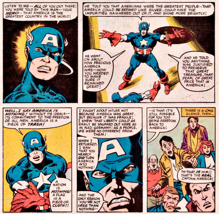
Peter Gillis and Sal Buscema deliver one of my favorite Captain America speeches ever in What If #44 (April 1984). Be safe this weekend!


Thursday, July 3, 2014

Looking-Glass Layout with Steve Ditko


[Here's the penultimate comics layout analysis from my old comics blog. In this entry from 9 August 2010, I'm looking at the work of Steve Ditko . . . ]

I've moved on to reading all of the Lee-Ditko run on Amazing Spider-Man, and I want to take a break from the Kirby analysis by looking at Dikto's layout for page 16 of ASM #23:


I'm struggling for a vocabulary that would allow me to express what I'm seeing on this page that distinguishes Ditko from Kirby.  Perhaps the best way to express the distinction is that Ditko concentrates on motion within panels instead of motion between panels as we see in Kirby.  Ditko's characters don't flow as easily from panel to panel as Kirby's do; Ditko will often (in other issues of AMS) make radical shifts in viewpoint as he makes the transition between panels.  I can't recall Kirby making use of extradiegetic arrows to guide the reader's attention as happens in panels 6-8 of this page.  So a point for Kirby?  Maybe . . . but I still really love the layout of this page and find Dikto a dynamic artist.

What impresses me most about the page is Ditko's use of mirrored panels--not in the panels' contents, but in their shape and placement on the page.  The top half of the page (panels 1-4) is repeated in the bottom half of the page (panels 5-8), but in a way that creates an "X"-pattern.  The big panels 1 and 8 form one stroke of the X, while the little panel sequences 2-4 and 5-7 form the other stroke.  Put another way, Ditko takes the second set of panels and flips them left to right to generate the "X"-shape.

The contents of the panels support this structure: panels 1 and 8 are the only two to feature both Spidey and the Green Goblin.  In both panels, Spidey is positioned toward the outer edge of the panel while the Goblin occupies the inner edge (additional instances of mirroring across the y-axis of the page).  Spidey is upside down and swinging up and to the right in panel 1; in panel 8, he's still upside down, but now swinging down and to the left.  (He's also coming toward us in panel 8 while moving away from us back in panel 1.)  The Goblin leans left in panel 1 and right in panel 8, yet more mirroring.

Panels 2-3 and 5-6 are also mirrored panels, but this time they flip left across the y-axis of the page instead of right (as in the case of panels 1 and 8).  Panel 2 shows the Goblin's hand releasing a pumpkin bomb; panel 3, Spidey's hand shooting a web to block the bomb.  The diagonal line repeated in both panels (hand/bomb in panel 2, hand/web/bomb in panel 3) is then repeated yet again in panels 5-6.  However, this time, the characters have traded places: now it's Spidey who acts first in panel 5, and the Goblin who wards off the attack second in panel 6.

Panels 4 and 7 offer similar layouts yet utterly different contents.  In panel 4, it's Spidey who acts, tossing the pumpkin bomb behind him to his left (and our right).  In panel 7, it's the Goblin's turn: he pulls Spidey's web in the opposite direction (behind him to his right and to our left).  The curves formed by the motion lines of Spidey's arm in panel 4 and the web shape in panel 7 are mirror-images of one another.

So while Ditko does feel the need to clarify the diegetic sequence of the page's action with the arrows connecting panels 6-8, he nonetheless does a brilliant job of integrating the entire page through an innovative page layout.